You need only look at the success of sponsored advertising, as found on search engines and elsewhere, to see that copy is key to an ad’s success. After all, these ads are pure text. Not a picture in sight. And by success, I mean the ability of an ad to cause a user to click on the ad to get more information.
Why is this so? Aren’t we a post-literate society?
 I think the answer is trust. No one has the time to click on a link that doesn’t promise something of value. It’s difficult if not impossible to do that with imagery alone, both online and in the real world. Even red octagonal traffic signs, which promise the opportunity of not getting creamed by oncoming traffic, have a big “STOP” message to improve response rates.
Whether you’re writing a two-line sponsored search listing or a 50-word online display ad, pay attention to every word, and ask yourself if you are promising enough to the reader to generate a click. While you’re at it, here are other tips to keep in mind:
Include a headline. That is your promise in a nutshell.
Don’t shy away from longer headlines. They can work as well as shorter ones.
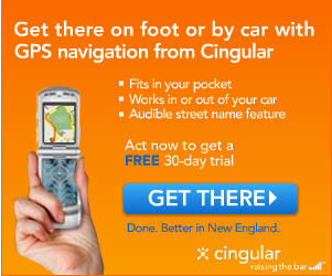
Dramatize a benefit of your product or service. Don’t just say, “Our GPS cell phone lets you navigate even when you’re not driving.” Say, “Get there on foot or by car.” That’s the benefit of this type of mobility.
Ask for the click. Don’t expect the reader to know that more information is a click away. Unless it’s clearly a hypertext link, be sure your copy asks for the desired action.
The ad pictured above is a good example of all of these lessons. You can see it in action on adverlicio.us.
What’s your take on this statement?
Web surfers tend to ignore banner ads especially those with too much text.
As a consumer and avid web-surfer, I would say that’s true. Who likes reading ads while reading that article on espn.com or cnnsi.com
I would agree with the first half of that statement. Web surfers tend to ignore banner ads, period. It’s interesting that when eye scanning heat maps are conducted, banner ads that blend in or complement the look of the rest of the site tend to do better than those that stand out. At least in terms of time spent viewing (measured in microseconds).
Getting people to notice a banner ad is one thing. But once they do, how to you induce a click? My theory is you need some strong copy to do it.
Does anyone have examples that would disprove this?