Google Optimizer puts a potent tool in any marketer’s hands

Until this week, the options for marketers who wish to test landing pages were unappetizing. You could create home-grown A/B tests, or you could turn to an online testing system offered by companies such as Offermatica or Vertster. The first option was slow and cumbersome, while the latter was yet another layer of campaign management. Google changed all that with the release on Tuesday of their Google Website Optimizer.

The Eisenberg brothers, authors of the web marketing bible Call To Action, define a landing page as “a specialized page designed to induce the shopper who responds to an ad to make the purchase.” Once you’ve paid for a click that brings someone to this page, you’d better be sure to maximize the odds of a conversion. That’s where A/B split testing comes in. Using the original page as your control, you create a statistically reliable test with a second, similar page.

The test’s hypothesis is this: That the test page, which has slightly altered  content such as headline, body copy, offer or pricing, will not improve response.

Running both pages in equal numbers proves or disproves that hypothesis. If the test page does out-pull the control, it then becomes the control, and you pit something else against that. And so it goes until you’ve explored all combinations of variables or the campaign is over.

Life was simpler for direct mail  and direct response print marketers, simply because of the time and cost restraints of that medium. You needed to test, but the number of test variables was limited by the slow feedback loop and the cost of split testing using ink and paper.

But if you’re running an online ad — one that generates hundreds of clicks a day — you’d be crazy not to be continually testing something. All the time.

Online marketing shifts the constraint away from the medium itself and squarely onto campaign management. In my experience, a majority of marketing organizations simply cannot manage the level of testing that they could or should be doing for a given campaign. Those who are loathe to test are spending more for every conversion they generate.

Google has stepped in to help. Although their new tool doesn’t address the “expertise void” in testing (and they recognize that, as you’ll read in a moment), the Optimizer does promise to make the automation of testing within reach of just about any marketing organization.

According to product manager Tom Leung, it enables advertisers to “receive up to 10,000 versions of a web page.

“This tool lets you have one page, add a few Java scripts and
then when visitors hit the page, there are different combinations served.”

If the Optimizer is anything like Google’s other recent web marketing game-changer, Google Analytics (which is the refined suite formerly known as Urchin), this will be a direct response marketer’s dream.

The Website Optimizer is free to marketers using Google Adwords. Because A/B tests require experienced content professionals to get right, it is no surprise that Google has created a legion of Optimizer Authorized Consultants. The list of consultants will be growing (hey, Google, you have my information — call me, babe!), but now includes Optimost, EpikOne and Future Now, the company that published Call To Action. Now why doesn’t that surprise me?
Print and other traditional media spur retail web searches

If you thought pay-per-click (PPC) search engine marketing would make your marketing planning easier, think again.

PPC is simple and brilliant: Show online ads to someone who is searching based on the keywords they choose as a proxy for their buying intentions. It’s a proven way to catch qualified prospects when they’re considering a purchase. Within limits, it’s also quite measurable.

So life got easier, right? Certainly you can now eliminate much of your traditional advertising and pile on the keyword buys. There’s your plan. Now you can go home. 

If that’s what you’re thinking, you may want to think again. 

Specifically, consider what sends prospects to their computers in the first place. A survey by the Retail Advertising and Marketing Association (RAMA) reports that consumers start their web searches based on many off-line stimuli, including much of traditional advertising.

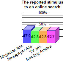
Consumers said that they were most motivated to begin an online search after viewing advertisements in magazines (47.2%), newspapers (42.3%), on TV (42.8%) and from reading articles (43.7%).

Although it wasn’t specifically addressed here, you can gather that in these cases off-line advertising probably triggered a search for a brand (the advertised brand, that is), as opposed to a generic search (one on the category of product). In this way, the off-line stimulus greatly improved the odds of your PPC ads finding prospects who are ready to buy.

Media that were most likely to motivate an online searchPut another way, the stimulus improved the PPC ads’ conversion rates. If you were to read the PPC stats in a vacuum, you’d confer more power to the medium than it deserves.

Imagine two men in a fishing boat, one doing all of the casting of the line and reeling in of the fish, and the other man standing ready with the fishing net. It would be unfair to claim that the guy with the net was actually doing any fishing, just because he brought all of the catches into the boat.

So which of the off-line media reels them close to the boat most effectively?

I show the chart above not to demonstrate the superiority of one medium over another. On the contrary, I’m struck by how close they are in terms of “most motivating” a search. It instead shows what an incredibly mixed bag these media present the beleaguered marketing planner, and how technology, at least in this case, isn’t cutting that person any breaks.

Twitter’s sudden celebrity will soon become a fight for relevance

Twitter is a way to broadcast via your cell phone or computer. What do you broadcast? Whatever is immediate and local. You disclose your thoughts, observations and whereabouts — and anything else you can fit within a 140-character limit text message. Here’s an unofficial Twitter wiki. Its Press and Media section has links to some of the latest buzz on this social media app.

Twitter appeared quickly and will, in my opinion, flame out just as fast. Once it has died back down to a glowing ember, I suspect it will reside where it seems most suited: with younger students and others with plenty of time, a big friends list, and a high opinion of their own text-messaged voices.

Because your cell phone can get deluged with “Tweets” (one attendee of the SXSW conference in Austin reported receiving 3,000 of them during her time there), it appears that most people finally turn the mobile feature off. Who of us, after all, has an unlimited text message plan and a high tolerance for deleting messages as fast as they arrive?

But turning off the ability to receive these messages on my cell phone takes away one of Twitter’s major appeals: The ability to “microblog” from anywhere, and read other people’s insights dashed off from whatever house party or night club you weren’t able to get to.

I’m always looking at these phenomena for how they might bubble up into the generations of working stiffs who are hoping technology can aid their productivity — or ease their workday the way a smoke break used to when more people smoked.

This technology has me curious, but unless there is some improved way to filter the spamming effect I don’t see Twitter as surviving the battle for mainstream relevance.


April 17, 2007 — An update:This weekend I succumbed. I needed to experience Twitter for myself, especially since I was reading intriguing comments on other people’s blogs, including this one. Keeping the mobile component turned off, I created this account: http://twitter.com/TheLarch (yes, I dropped my name’s trailing “e” — it’s a silly Monty Python joke).


I’ll do a new entry soon with my thoughts.

How to make a direct mailing break through the clutter

The most successful business-to-business mailing I ever produced was early in my career, for a company called Acro Automation (http://www.acro.com*). It was a lead generation letter, mailed in a standard window envelope. But the envelope was stuffed with a wad of real shredded money. I bought the tangled remains of one-, five-, ten- and twenty-dollar bills direct from the U.S. Treasury, in eleven pound boxes. Each was enough to fill approximately 2,500 envelopes. Showing money fragments through the window of the envelope, along with a printed teaser that explained their relevance, was enough to trigger an 11% response rate from a notoriously non-responsive audience of production engineers.

A publicity shot of me with the Acro envelopes, back when I still got carded in barsShortly after that mailing the government called an abrupt halt to the sale of this byproduct of monetary obsolescence. They apparently didn’t appreciate my use of ex-money to generate more of the real stuff. But the lesson had been duly noted. I had learned how to reach out and grab the reader by the imagination: Be unique and outrageous.

I was reminded of this lesson when I read Seth Godin’s account of marketing one of his books. Read his story and take heed. Reconsider that me-too mailing you were planning for your next promotion. Why settle for average when you can break records — and in the process, accumulate great stories, such as mine about the Treasury, and Seth’s about his similar, bureaucratic battle with International Paper?

*I had nothing to do with their current web site, by the way, but I was involved in the acquisition of their four-letter domain name. At the time I had no idea how rare these would become. I was also responsible for another one of those: www.sofa.com. If I only knew then what I know now, I would have treated these as the valuable client assets that they are!

Imagine a web site without a click

Thank you to The Thinking Blog for tipping me off to this amazing Flash-driven site where you experience web browsing without using your mouse button. The demonstrations provided can be quite disorienting, but the site reminds us that web navigation is continuing to evolve. Some of the techniques are already used today.

Ilker Yoldas, the blog’s author, suggests that this experience could be the interface used where a mouse button is impractical. He suggests the Wii. I’m also thinking about a giant touchscreen, where tapping is less intuitive than simply dragging one’s finger.

I strongly suggest you check out both www.dontclick.it and Ilker’s blog entry about it. And while you’re at his site, for pity’s sake, don’t shoot the dog!