Video shows the use of buying modes in persuasion architecture

Personas are used to help in web design — especially in optimizing its content. The goal is to identify important user types and speak to them in their own language. Personas are traditionally archetypes, such as the following (these are summaries of longer personas, pulled from three randomly-selected persona sets):

  • A single, 50-something female executive researching healthcare options for her mother, and intending to share her findings with her siblings
  • A young man who works as a car mechanic, considering buying an engagement ring online and afraid of making a mistake
  • An elected city official responsible for recommending a source for a fleet of utility vehicles, who is unaccustomed to using the internet

Purchasing styles are implied within those personas, and those varying styles are key to how a site is designed to cultivate interest and close the online sale. It’s knowledge of these varying purchasing styles that helps set the tone and composition of a site — choosing what goes where on a page, and how is it presented.

This begs the question: Since purchasing styles are so important, why can’t you focus on those alone, and place other aspects of a persona on the back burner? The answer is you can.

Roy H. Williams, along with The Eisenburg Brothers, tout a four-quadrant system for categorizing a person’s purchasing style. It is as follows:

  1. Fast + Logical = “Competitive”
  2. Fast + Emotional = “Spontaneous”
  3. Slow + Emotional = “Humanistic”
  4. Slow + Logical = “Methodical”

These Modes of Persuasion Architecture are described at length in Waiting for Your Cat to Bark?: Persuading Customers When They Ignore Marketing.

View this video

Books like this one from The Brothers Eisenberg are all well and good. But they can be fairly lifeless. Then, this morning, I saw their dimensional approach brought to life. It was in a video produced by Patrick Sullivan, Jr., showing the home page of Mint.com, a slick personal finance site. See for yourself how various modes of purchasing are successfully addressed on this excellent site.

Is “click here” the web equivilent of an ugly red sticker?

A background in direct response can warp a person for life. Just ask a typical ad agency creative director. In a past agency, where I started out as the lone voice in all things direct marketing, I seriously think the creatives wanted to have me committed. I was reminded of that time in my career when I read this post in Copyblogger:

Many years ago, an advertising agency in my neighborhood hired me to consult on a direct mail project for one of the biggest nonprofit organizations in the country. One glance at the client’s test results revealed that the successful mail pieces featured big red stickers, the kind you often see on magazine subscription offers.

So one of my recommendations was to use a sticker in the new direct mail piece. From the expression on the designer’s face, you would have thought I had just relieved myself on the conference room carpet. He crinkled his nose in disgust and informed me that the agency “didn’t do stickers. They’re tacky.”

Needless to say the red sticker mailing, running as a control, continued to out-perform more attractive test packages. The ugly and unsophisticated won out, in terms of effectiveness, over the attractive and more contemporary.
Click here graphicI was thinking of this while participating in a discussion recently on the pros and cons of using “Click here” as an inducement.
Our team’s stance is simple and non-negotiable: The practice is bad form. They’re in good company. Jacob Nielsen, the Moses of usability best practices, carved his own Ten Commandments of web design on a virtual stone tablet, and #2 included “Don’t use ‘click here’ or other non-descriptive link text.”

Built into this commandment is the crux of his reasoning. If you employ link text that is not descriptive, you’ve wasting valuable words. But is this waste always sinful?

Effective Versus Efficient

“Wasteful” can be considered the antonym of “efficient.” And who doesn’t want to be efficient? Well, the answer is me — sometimes. That is, sometimes there are strategic reasons for a little “waste.” Stephen Covey is quick to point out in his book that it’s not called Seven Habits of Highly Efficient People. No, Covey chose the word “effective” for the title for a good reason.

If your web users are not particularly web-savvy, you may have to go back to “Web 1.0” in your copy and presentation. And that may mean slapping some “red stickers,” in the form of hackneyed hyperlink instructions over your web design. Only testing can tell you for sure.

The exception is if you are asking your user to make a commitment. In the case of “buy it now,” etc., you should still never use “click here.” To do otherwise would simply be too inefficient to be optimally effective.

How to handle blogged ambivalence (or worse!) of your product

I agree with Sam Decker that a lukewarm or negative review posted online is not a terrible thing. Since there will be many glowing reviews of your product (one hopes), the contrasting viewpoints will lend authenticity to the whole.

But how does one respond to a negative review — especially one from a respected and well-known source?

In other words, talk of social media firefighting is common, but where are good examples of a well-deployed firefight in action?

I’ve come across a few, but the one I found yesterday is excellent. Be sure to scroll down this post by Dave Berkowitz to see the comments of affronted author, Joe Jaffe.

It’s not surprising that a veteran blogger would step forward to assert his side of the discussion with measured tact plus a sprinkling of clarifications. Jaffe’s comments are a textbook example of how to properly defend your brand in a public forum.

My one edit, if I had advised Mr. Jaffe, was to cut the line, “Not much more to say except thanks for taking the time to read 27 pages [of the 300-page book].” Ouch. That sounded defensive and unfair.

Finally, to David’s point in his Caveat #6, I too find marketing today a great amount of fun and I think most in the business do.

Marketing is especially fun when the rules of engagement are being written in real time. To paraphrase jazz poet and musician Gil Scott-Heron, the marketing revolution will be televised.

Research proves it: People like it when your web site is nice to them

As mentioned earlier in this blog, Daniel Pink has done informal research into how your web site’s prompts and error messages could stand a little humanity. Now there is formal research to back this up. New Scientist magazine (paid registration required) covers research that proves “computer glitches would be a lot less annoying if the machines were programmed to acknowledge errors gracefully:”

The trick, according to a researcher who has analysed users’ responses to their computers, is to make operating systems and software more “civilised” by saying sorry more often. That way people won’t feel they are stupid or at fault, so they become less apprehensive about using computers, and perhaps more productive and creative.

National Tsing Hua University’s Jeng-Yi Tzeng is quoted in the article as being inspired by the Chinese saying, “No one would blame a polite person.” He wondered if this applied equally to “polite” computers.

So Tzeng wrote a couple of versions of the same computerized guessing game, and recruited nearly three hundred students to play one version or the other. The control group got a brusque version, and the test group, an apologetic one.

The game’s goal was to guess a Chinese saying, but annoyingly, the program often made users guess the same sayings again and again. It was also unhelpful in the clues it supplied during the guessing process. The control group received a typical set of error messages, but the test group saw messages such as, “We are sorry that the clues were not very helpful for you. Please try the next game.”

After half an hour’s play, users of both versions were equally disappointed with the game itself. But those who had played on the apologetic version were more likely to describe it as fun, and 60 per cent of them said the apologetic feedback made the game more enjoyable.

However, apologies made no difference to 25 per cent of them, and 12 per cent said they felt they were being manipulated. Tzeng will report his findings in a forthcoming edition of the International Journal of Human-Computer Studies.

“It is what I expected,” comments Eric Horvitz, manager of Microsoft’s Adaptive Systems and Interaction Group. “Arrogant software rubs people up the wrong way just like an arrogant person would.”

The take-away: Take another look at the error messages you show your prospective and current customers. Although hyper-politeness can be as grating in certain cultures as bluntness, softening messages, and making more “human, ” can only serve to improve outcomes.

Your web site’s messages should show a little humanity

It’s simple. The reason for Apple’s spectacular success is that, although the human mind is capable of impressive calculation, what makes it uniquely human is its ability to dream.

When they aren’t trying to parrot what Windows-based machines do, most Apple products promise a more fertile ground for right-brained thinking. Mostly these products succeed. And they do because they touch us in the heart at least as much as in the mind.

Now think about your web site. Is it still behaving as if its users are more robot than human? Watch out, because your competitor’s sites might not. They may realize that the most buttoned-down web users haven’t forgotten to smile.

Author and public speaker Daniel Pink made this point, but on a more global scale. His book from two years ago, A Whole New Mind contended that as workers in a new, Conceptual Age, we need to sharpen these six skills: design, storytelling, creative collaboration, empathy, play and rendering meaning — although he labeled them far more colorfully than I just did, which is why he is the famous business author and not me.

Lately he’s been talking about using empathy in public messages. Once again, he was speaking more globally than messaging on web sites. But just review some of these examples and see if you aren’t inspired to breathe some warmth into your site’s content:

Restaurant Sign:
Don’t worry, this line moves really quickly.
Movie Theater Electric Hand Dryers:
We don’t like them either, but they are the most energy efficient and environmentally-friendly choice.
Hong Kong Airport:
Relax. Train comes every two minutes.

These three have one thing in common. They respectfully ask us to take a breath and side with the human being who is delivering the bad news.

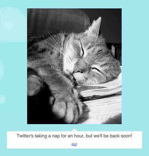
How can this relate to your site? One of the most lighthearted set of web error messages come from the disruption-prone Twitter site. Although the originals were LOLcats, the latest batch — such as this one — take a more conventionally cutesy tack:

A typical (and all too frequent!) Twitter error message

Is this frivolous — therefore below consideration for your site?

That depends. If your current error messages are pushing people over the brink, you’re losing business. There is nothing warm or cute about that business reality.