Testing uncovers 6 keys to landing page success

Landing pages are expansions of ads. Every banner, email offer or sponsored listing worth its salt points to a single, hard working page. What sort of work do these pages perform? Selling, plain and simple. But to succeed, the approach to designing these pages is neither plain nor simple. Tools like Google Website Optimizer allow you to test for yourself. These automated systems help you discover exactly what combination of components works best at converting your page’s visitors into customers or qualified leads.

But what components do you start testing? And what factors should you be paying attention to as you get started?

Luckily, a lot of testing has already been done, and their findings tell you a lot about the complexities of the human mind. Here’s an excerpt from a wonderful report from Marketing Experiments:

Landing Page Performance Elements

Through extensive research, Marketing Experiments has identified six essential elements that affect landing page performance:

Friction — [This is] caused by elements of the page that require a prospect to do extra work and increase the likelihood of abandoning the page due to fatigue or irritation. Incentives such as bonus gifts or special offers can make the offer feel more worthwhile and encourage the visitor to continue.

Visitor Motivation Level and Type— [These] are factors that influence how many will remain on the site or bounce off. The nature and level of visitor motivation is essential to what landing page attributes will prove to be the “stickiest.” If people really want something, they’ll put up with more friction.

Value Proposition — How quickly, clearly, and effectively the landing page conveys the site’s value affects its ability to move visitors to the next step and not abandon the site. [The authors call this level of abandonment the “bounce rate.”]

Anxiety — All visitors arrive at a site with an initial level of anxiety caused by their perceptions of the relative risks associated with the site, the company, and the product.

Credibility Indicators — You can improve click-through and conversion by including page elements that convey trustworthiness through credibility indicators such as awards, privacy policies, certifications, testimonials, and longevity statements such as “serving the needs of ___ for more than 15 years.”

This report also has an excellent exploration of when to use short versus long copy. Happy testing!
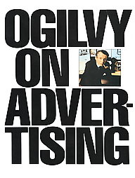
Ogilvy on web advertising

My alternate headline for this post is: Winning web headlines can be long, but watch your column widths. Here’s why …

Ogilvy On AdvertisingThe book that first inspired me to get into direct response — a move that led directly to my love of interactive marketing — was written by a famous ad man. Remarkably, David Ogilvy’s Ogilvy on Advertising is still in print. More remarkable is how much of his advice on successful direct marketing, print and television ads is still relevant. And directly transferable to the web.

I was thinking of him again today when I was in a design meeting where one of our web designers was counseling against an overly wide column of text. He said, “We don’t want this column to span more that 400 characters. More than that fatigues the reader.” Wow, I thought. This advice is almost verbatim from a book that predates the web as we know it by at least 10 years.

Headlines are another source of attention — and often misunderstanding. Although headlines linking to web pages can be short and still be effective, they should be long enough to get the job done. Abe Lincoln, when asked how long a soldier’s legs should be, was said to have answered, “Long enough to reach the ground.”

I’ve learned a lot by following the advice of the excellent Brian Clark, in his CopyBlogger. He periodically singles out strong headlines, based on his experience in the business. (And thanks again, Brian, for citing one of mine). His criteria remind me a great deal of Ogilvy’s, which was based on some of the deepest readership research done at the time for advertising. Here is Ogilvy’s take on the headline:

[Our research] reports that [print] headlines with more than 10 words get less readership than short headlines. On the other hand, a study of retail ads found that headlines of 10 words sell more than short headlines. Conclusion: If you need a long headline, go ahead and write one.

Other tidbits of his that apply to online headlines and links include the following:

  • Headlines containing news are “surefire” — they are recalled by 22% more people than ads without news (and lots of pay-per-click research shows that they generate more clicks)
  • Never use all capital letters — they’re less readable in both print and online. And with the web, people may think you’re shouting, to cite the classic email netiquette tip
  • Whenever possible, promise a benefit

So what is the longest character count we counsel for headlines? Keep them to 75. It’s the standard set by Digg for their listing’s headlines. And this number is just a few characters greater than the number that is indexed by Google (according to lore and legend) when Google’s spiders read a page’s Title tag.

Which brings up an argument in favor of the longer headline that Ogilvy couldn’t have anticipated. Length improves the chances of including a keyword that will move your page higher in search engine results pages. That’s the sort of down-and-dirty selling tactic that the late Mr. Ogilvy would have loved.

Get out your yellow highlighter to emphasize your most important web copy

Two of my favorite sites use a technique to make their short, punchy web copy even stronger.

  • 37signals is a smart, irreverent Web 2.0 developer of web-based collaboration and development solutions. I’ve praised one of their products in this blog: Basecamp, an ASP alternative to MS Project. They market their products through a web site and attached blog that aren’t afraid to break with convention. That includes the way they draw your attention to important sales copy.
  • Very Short List (VSL) does the same. It’s a fun, free subscription email and web site that delivers a list of exactly one interesting product, service or web site every single day. The copy they employ to describe each “VSL” is always short and clever. To further aid in scanning, VSL highlights important points in their message.

VSL Thumbnail - Click to enlargeBoth use the technique you see in the sample graphic (click to enlarge). They use a text highlighting technique that any web site could adopt but few do. It’s a clean if somewhat “cute” alternative to bold and italics.

Is this new formatting based on science? In other words, do metrics exist to show that this technique improves readership, or helps convert readers into customers?

No. Josh Fried of 37signals admits in Copyblogger.com, “We don’t have metrics [to support our design changes]. It’s all gut.” (I agree wholeheartedly by the way, with Brian Clark, author of Copyblogger.com. He cautions in this post that listening to designers and one’s instincts can be a dangerous practice when the outcome could be a major decline in the bottom line of your business.)

So right now web marketers appear to be flying blind when they are using this technique to showcase important copy. This could be remedied.

I’ve made a point to talk to anyone I know who conducts eye tracking heatmaps to see if they’ve ever seen any evidence that this hinders or helps a reader through the thicket of online copy. And if they haven’t, would they like to give it a try?

In the meantime, I welcome your thoughts on whether this hip spin on copy formatting will prove to be more than a novelty.