Using Google Analytics’ New Report Dashboard

My work with Accenture has meant this blog has been silent since I joined. I’m loving my work there, by the way. But as for the central focus of this blog, I’ve been continuing to have fun in my off hours with web marketing analytics, especially using Google Analytics. If you use this app, you know they’ve launched a major upgrade of their reporting. It includes a way to create custom dashboards. Below you’ll find one small way I’ve used these new custom dashboards to save time and gain valuable insights.

Until I joined Accenture I was one of the contributors to Jason Fall’s exceptional social media marketing blog, Social Media Explorer. I miss being in such terrific company (they haven’t kicked me out of their Facebook group, something I’m very pleased about). I also miss those posts and the greater audience they had afforded me for my ideas on measuring social media.

But all was not well. I had always wondered how often people viewed my posts, the way I can with this blog. Yes, I could see which posts were the most likely to go viral. I could get that like anyone, from this summary of all of my posts there.

Then Jason shared with his contributors full reporting access to his Google Analytics metrics. Heaven!

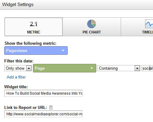
Now I had a different problem: I could see aggregate information, but there was no easy way to view just the information about my pages. If the structure of the site had been, say, “domain.com/jefflarche/blogname,” I could view only the pages starting with /jefflarche/. That’s not the case, though. So I walked away, vowing to someday find a way to create a report that would give me a breakdown of my posts, at least for the KPI of Page Views. I got busy today by creating a new Dashboard for the profile. I then populated it with Widgets. Here you can see what the set up looks like for each widget I added (one per post):

Below are the steps taken in this form:

  1. I chose the widget called “Metric.” This shows one number only (along with a couple of others, for context), instead of a chart, a timeline or a table
  2. I chose the metric of Pageviews. But I needed to add a filter. For that, you can see I chose to only show the count for pages that contain a unique string. For this example, I chose the unique string social-media-awareness-measurement/ portion for this post’s URL
  3. I gave the widget the title of that post and linked to it so reviewing content for hints of popularity (or lack thereof!) would be easier

Pretty easy, no? Once I had added a widget for each, this is what I got:
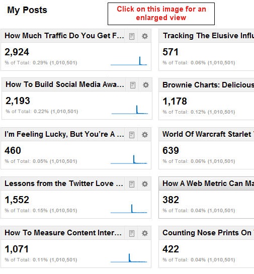
So what insights can I glean from this? First of all, it took a while to build an audience. I learned as I went along, from the first post (lower right corner) to the latest (upper left). I knew this from other measures, which made it particularly sad for me to walk away from the posts. I saw a growth for 693 percent, comparing the views my first post got versus my last.

Turning Information Into Insights

Here are other insights:

  1. People love “how to” content, and respond to headlines that contain those magical words. (I knew this from my direct response days, but it’s cool how thoroughly this has been carried to the online world.)
  2. People like to read reviews of relevant books. That’s what I did with the extremely popular post Lessons from the Twitter Love Guru
  3. Sparklines can give valuable hints to user habits

This last one isn’t readily apparent. I’m going to assume you know what a sparkline is and just say that each of them above shows a sharp rise and fall in readership. After the week it has been posted you can see the view plateau very near zero. It’s to be expected. But there was an outlier, which you could only see if you viewed the full report. It’s shown above right.
Not only did this post not immediately “click” with readers (look at the leading tail), but once it did, its tail at the end is thicker, showing more ongoing popularity. If you’ve been a reader from the start, you’ve already read here and elsewhere about The Long Tail. Here it is in action!

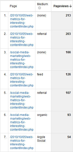
This odd sparkline caused me to dig deeper, and I saw this report for all sources of visits to that page since it post (to the right).

It shows a significant number of links from referring sites and search engines. The referrers obviously liked the content enough to send their readers to it. And search engines? This is the ultimate long tail. I even got four visits from Google for the phrase “measure if people share your content on social media.” Believe it or not, this is hotly contested (I no longer show up for this phrase — at least in the top three pages).

By the way, “feed” stands for Feedburner, which means the fourth (or third, depending on how you look at it) source of visits is people who read Jason’s blog using an RSS reader.

As I said, it pays to be in cool company. By the way, here’s a shout-out to Argyle Social. They’re right near the top as a source for clicks to this page. Their latest post, Is Post Automation Effective? particularly fitting. I would say certainly say yes!

A Link To All of My Social Media Explorer Posts

If the headlines of the above got you curious about my content, I encourage you to visit this summary page, with links to all of them. I’ll be watching this new dashboard to see just how many of you do!
Why I joined Accenture

If you’ve been wondering why I’ve been so silent lately, it’s because I’ve been in the midst of a major career move. Those of you who know me well are used to my willingness to dive into something and master it. I’d like to think there has been a pattern to it all — that there’s a method to my madness.

To explain how my 20-plus year career has led me to find Accenture (and them to find me!) I’ve put together this video. Enjoy!

Make your press releases behave more like blog posts

Reading my headline, you may be thinking, “Why would I even want the press releases on my corporate site to be more blog-like? Aren’t blogs kind of, well, flaky?” The answer has to do with three dimensions of a sound digital communication strategy:

  1. Improved engagement
  2. Improved compliance
  3. Improved search engine presence

Improved Engagement

Here’s what I mean by improved engagement. It has to do with engaging (involving, informing) web visitors. If your site provides more information about a newsworthy product or service, the chances are better that a web visitor will want one. There’s an old salesmanship saying: “Telling is selling.”

Of course, engagement isn’t the same thing as boring someone to death. That’s why the web is such a great way to deliver content. When content is served up properly, there are ample spaces for long copy to breathe. This copy can be broken up between several pages, headings or hidden div layers. When a visitor wants more information, he or she simply has to click, or to scan headlines and sub-headings.

Some think you can’t pack much selling information into a stodgy old press release. They’re quite mistaken. Press releases that are loaded into a web site can describe features and benefits. Because of the journalistic style of them, these descriptions are usually short — or at least written in an easy-to-digest inverted pyramid style.

To keep these online press releases relatively short, yet packed with selling power, writers should link often to more detailed information elsewhere within the site. Just as I have with my link to a definition of the inverted pyramid style of journalism (earlier in this paragraph), a single link can speak volumes for those curious enough to click.

Improved Compliance

Just as you can (and should!) link off of the press release to other source information, you should consider linking to a given press release from blog posts on that topic. This allows you to speak more loosely in your blog posts without running afoul of the legal team in your company who want to ensure the company won’t lose credibility or get sued.

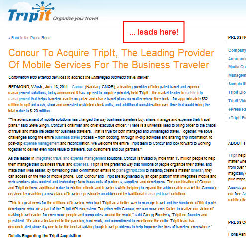
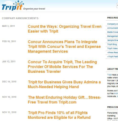
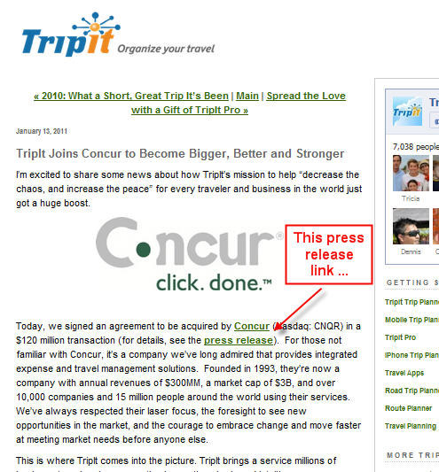
Below is an example, from the press release section and blog section of the Tripit.com site:


Look at the headline for the blog post: “Tripit Joins Concur to Become Bigger, Better and Stronger.” It’s a lot easier, from a compliance perspective, to say this in a blog post. Journalists and the financial industry — the two groups most likely to be interested in this story — would both regard a press release using this language with some skepticism.

However, by linking to the press release talking about the same event, this level of hyperbole is understandable … even expected. Blogs are about opinion. Press releases are about cold facts.

So how is the press release in this example behaving more like a blog post? You really can’t tell unless you look at the source code, but this press release was posted using the WordPress blogging system. Which leads to better search engine performance …

Improved Search Engine Presence

Here are four ways that serving up your press releases the way Tripit.com has is smart from a search engine marketing perspective:

1. More press releases = more search engine optimization

This technique gets your public relations or marketing teams out of the mindset that press releases should be rationed out carefully. Just as blog posts go up often, so should your press releases. Mind you, this does not mean more spending with services such as PRWeb or PRNewswire. That’s what got your PR team into the mindset in the first place!

Instead, continue to use those far-reaching press release distribution services for the big announcements. When you do, replicate the press releases on your site. Then post others that aren’t earth-shattering news, but can support other product or service launches or upgrades.

Most corporate site web visitors don’t seek out press releases. But if you link to specific releases from blog posts, the content will reinforce what’s in that post. The intra-site links will also slightly boost the rankings of both pages in the eyes of many search engines.

2. Double the odds of getting into top search engine results pages

With the one-two punch of a blog post and a press release, you double your chances of ranking high. That assumes that none of the content between the two items is shared. Search engines frown on identical copy one pages that it is indexing. True, you can excerpt the press release in your blog, but don’t get carried away.

3. Provide search engines with a second RSS feed

One of the reasons that search engines love to rank blog posts high in results pages is they timely and are easily accessible through RSS feeds. When a blog post goes live, a search engine that has access to its RSS feed has the inside scoop, so to speak. The same can be said for your press releases when you use a blogging platform such as WordPress to publish them.

4. Benefit from search-engine-friendly page URLs, categories and much more

Here is the full URL of the press release example shown about:
http://www.tripit.com/press/2011/01/concur-to-acquire-tripit-the-leading-provider-of-mobile-services-for-the-business-traveler/

This is exactly the sort of URL that search engine spiders can sink their teeth into!

Finally, a press release can be given a “category,” such as Tripit’s “Company Announcements” (the full length is truncated and you can see the left edge in the upper right corner, below. This allows that category page to be indexed by search engines as well. Here’s an example from the Tripit.com Press Release section:

I could add one more reason to use this technique: It’s extremely easy to install and test. Try it with your corporate site. If you already have, let me know what you think of it.

Have you noticed, by the way, that I haven’t mentioned press releases in PDF format once? It’s only because I trust you, dear reader, to not even dream of using this unwise tactic with your company. But if you have no choice, please share this posts with the powers that be and beg them to reconsider their folly.

The marketing power of a press release is a terrible thing to waste!

When Virtual Pageviews trump Events

There was much excitement when Google Analytics unveiled its Events metric. This meant web analytics could store several levels of information on a specific action, and associate that information with a unique web visit and visitor. Before that, if you wanted to — let’s say — record a download, you’d need to create a Virtual Page View.

So why did I recently blog on Jason Falls’ site about creating Virtual Pageviews when recording interest actions, such as “Send to a Printer,” or sharing actions, such as “Email a Friend?” or “Share on Facebook?” Why don’t I just create Events?

Using AddThis To Talk To Google Analytics

The answer is simple: If you consider sharing to be a goal of your site, you may want to set it as a Google Analytics (GA) Goal. Events, for all of their power, can’t be set as Goals.

Another action that Events are commonly used for is downloading white papers. Events seem perfect for this because you can set and capture a number of variables, such as title. In other words, you can set the Event Label as the title of the paper. But if you want to measure this as a Goal in GA, you’re out of luck.

Events don’t even “talk” to Goals. [This is no longer true – changes to GA allows any event to be used as a Goal – JL] Let’s say you want to generate a report showing how many people who downloaded a white paper remained on the site for three or more minutes. The time on site can be set as a GA Goal, but you can’t easily generate a report showing the percentage of those who downloaded that remained on the site for that time period.

You can do all of this with GA Virtual Pageviews.

My rule of thumb is this: If you need to identify more than one variable with an event (such as identifying various Actions and Labels), and you do not need to correlate these with GA Goals, used Events. For all else, stick with Virtual Pageviews.

How To Track Content Interest Index In GA Using AddThis

Here is that how-to post I was referring to:

How To Measure Interest Using Google Analytics and AddThis, posted on Social Media Explorer by Jason Falls.

Studying a Twitter ecosystem one user at a time

If you’ve been following my (roughly) monthly posts on Jason Falls’ blog you know that I’ve taken this tack: On his blog I cover the key concepts of a particular web analytics approach, then provide additional support for that idea here.

A recent example is from two months ago. I posted about the use of Brownie Charts as a way to report Content Interest Index. I posted a parallel piece here on another use of the technique (Using Brownie Charts to Measure Bounce Rates). You could say this blog has become my laboratory: Results of preliminary experiments are described here, while the “real” story is broken on Jason’s blog. Tomorrow will be a little different.

Tomorrow, on Jason’s blog, I’ll be posting on someone else’s innovation. It is a review of an extraordinary book: Hashtag Analytics. I’m a huge fan of its author, Kevin Hillstrom, and over the years I’ve spent way too many hours creating Excel-driven models in order to replicate and fully understand his findings.

I’ll be doing that again, this time in support of Kevin’s approach to monitoring Twitter communities. Check back at this tag (hashtag-analytics) to read updates on my “lab work.” Ill be reporting over the next several weeks.

When A Hashtag Community Member Is “Removed”

You may want to check Kevin’s blog as well — especially later this week, when Kevin reports on the future vitality of the hashtag community #measure.  He posted about it last week. Now he plans to theoretically whack an active member. Here’s an excerpt from his post, where he invites readers to suggest whom to “remove”:

In every e-commerce company, somebody is responsible for forecasting sales for the next twelve months, by day. So it makes logical sense that any community manager would want to know what the future of his/her community is, right? This is something you don’t find in any of the popular Twitter-based analytics tools. This is my focus. This is what I love doing, it’s completely actionable, and it’s an area of analysis not being explored!

Next week [the week starting January 24 — that’s today!], we’ll do something neat — we’ll remove one important user from the community, and we’ll see if the absence of the individual harms or helps the future trajectory of the community. If you are an active participant in the #measure community, please send me a user_id that you’d like to see removed in the forecast … I’ll run an example for the individual who gets the most votes.

And in two weeks, we’ll compare the #measure community to the #analytics community … competing communities doing similar work … which community is forecast to have a stronger future?

It’s a fun stunt / modeling experiment that has real world implications. It should serve as a proof of sorts of the predictive power of his Hashtag Digital Profiles and the statistical work behind them. More relevant to online community managers, it should illustrate why showing your participants “love,” lest they never return, is of tremendous importance.

What To Expect Here

I will be applying my own Hashtag Analytics to a different online group — one that has the advantage of weekly meetings. It’s a fairly new group, so the rules may not fully apply (Does an acorn sprout follow the same natural laws of growth as a full-grown tree?). To ensure I don’t jinx my test or influence the community — in a far more direct way than Heisenberg was referring to — its identity will remain unknown until I’ve gathered and analyzed a critical mass of data.

Do stop back.

January 25, 2011 Update:

Here are two related links I didn’t have yesterday. The first is Kevin’s post where he removes that member to the #measure Hashtag community. The second is my review of his book today on Jason Falls’ blog:

  1. Hashtag Analytics: Removing a Member of the Community
  2. Lessons from the Twitter Lover Guru