Twitter sends flotsam and jetsam our way. Marketers: Take notice!

It’s been called a micro-blogging platform, an electronic water cooler and a wonderful way to keep tabs on friends and family. It’s Twitter, and all I wanted to know is: Is this something marketers should be tracking? Here’s my answer.

Yes.

You should track Twitter. But do it on your own terms. Or simply keep tabs on someone who is on the Twitter network. This concept will definitely morph, but it is not going away.

As promised in the footnote to my dismissive blog entry about this technology, I will recount my 14 days in Twitterland. For those who need a grounding in what Twitter is, I suggest you click on the link above. It loads in a new browser window, so you won’t lose your place. Are you back? Okay, let’s do this thing.

The first thing I discovered was that the people who would never, ever get a blog, or comment on other people’s blogs, have willingly signed up for Twitter. They have eagerly posted their 140 characters of news, weather and sports. I joke, but these posts do often resemble what contemporary television news has devolved into: The most superficial look at important headlines, plus trivia and human interest. And in saying that, I do not mean to disparage, because, like local news, this is very addictive.

Especially when you’re a friend or relative of the fellow “newscasters.”

When you’re part of this micro-blogosphere, all other activity you’re engaged in at that moment comes to a brief halt while you check your computer screen, IM window, or cell phone text messages to learn such tidbits as: “Man, that soup was hot. It scalded my mouth!” I’m making this one up, but it’s the type of flotsam and jetsam that comes drifting your way when you dip your oar in the vast Twitter Ocean.

Below is a sample I grabbed just now from the Twitter Public Timeline, a real-time stock ticker of global “Tweets” from those willing to share their tidbits with the world.
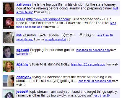
A sample from the Twitter public timeline

Again, I must assure you that I am not dismissing this type of information exchange. Just as the real definition of flotsam and jetsam is “potentially valuable goods jettisoned from a ship,” there are many gems that are shared with the friends, family and co-workers that one lets into one’s network. These gems slide into view suddenly and quietly, along with the detritus. It’s all disposable, but at the same time riveting.

In my 14 days on a small Twitter network (less than 10 participants), I’ve learned things. Oh, yes. I’ve learned quite a bit.

I’ve been sent links to interesting sites and videos. I’ve gotten to know more about distant friends’ lives. I’ve even discovered that I’ve missed an important appointment. And none of this was in my email box, which is crammed enough as it is. This is good on a micro level. And this is potentially important on a macro level.

I suspect that when the next Twin Towers catastrophe occurs, those on a Twitter network will get important and potentially life-saving alerts (“A plane just hit the second tower!”). Remember: On 9/11/01, when the voice lines of cell phones were jammed and inaccessible, and the electricity was off, the last goodbyes were sent to loved ones via cell phone SMS text messages. Grimly, this form of communication was still available, for brief, real-time expressions of fear, resignation and undying love.

If my suggestion of Twitter having that kind of utility shocks you, I must say it shocked me too. But it is also something that follows a clear path. Anthropologist Danah Boyd stated recently that initial web sites — we’ll call them Web 1.0 — were about ideas. With web sites and simple emails, people who didn’t know each other before became acquainted around shared interests and passions. Web 2.0 is all about people. Since the web has become ubiquitous (at least with the majority of the young, and 100% of the world’s information workers), you could keep connected with nearly everyone you know, and even have them broker introductions to those you don’t know (the magic of MySpace and Facebook “friends” and LinkedIn “connections”).

So what is the coming Web 3.0 about? Place.

Or, more importantly, place and time. Who is where I am right now? Other systems like Dodgeball hinted at this promise of a real-world / virtual network. Twitter expands on that promise. It is about place in a big way.

If you want to spend some mindless computer time, check out this Google mash-up of the Twitter public timeline. That will remind you of how quickly this world is shrinking … and help to demonstrate the global, and univeral, appeal of Twitter.

Finally, I offer this challenge. I want to see if Twitter can help me get acquainted with some interesting, like-minded marketing types. So I’m going to do a little experiment: I’m posting my Twitter posts to the world for the next week, and see who might want to add me to their Twitter Friends list. Specifically, I want to know how many people I could get to know. Can I connect with individuals whose flotsam and jetsam would make for an interesting and instructive complement to the Tweets I’m receiving now? And can some real business conversations come of it?

I’ll let you know.

Two givens for all healthcare site upgrades: labor-savings and ease of use

Content requirements for the web site of a healthcare system are formidable. Audiences include current and potential patients, as well as current and potential employees, physicians-with-privileges and donors. It’s no wonder that in their Ask the Experts piece, featured in a just-released Strategic Healthcare Communications newsletter, Dan Ansel and Susan Emerson recommend that the first step in planning site enhancements is to get a content management system. Their advice goes well beyond this tip, but two suggestions that I’ve never seen stated so bluntly are as follows:

  • Any enhancement should minimize the use of staff time, as this is often in short supply.
  • Any enhancement should be turnkey and simple to use. Simplicity and ease of use should apply to healthcare consumers and, just as important, to staff members who must administer the program.

I can’t think of many categories of sites where so much service must be delivered by such a thin staff. Dan and Susan have acknowledged this throughout their excellent “how-to” article, reprinted on their Private Health News web site.

NOTE: You may recall that I’ve talked about this company before, in a piece on generating ROI from your email newsletters.

New multitouch screens tickle the imagination

We were born with sensitive fingertips and spent our first months experiencing our world primarily through touch. Fast-forward to later in our development. We learn about computers — one of the most important modern sources of communication, interaction and business. And what happens to tactile experience? Poof! Gone, or at least gone dormant. Instead, we risk carpal tunnel and terminal boredom (both meanings) as we literally beat out our thoughts into keyboards, one letter and mouse click at a time.

It’s no wonder that a computing system designed to provide just a few scraps of visceral pleasure would generate a cult following. But even Apple’s desktop systems are limited by a keyboard and mouse as primary input devices. Bigger rewards can only come when we find better ways to receive our thoughts and intentions. The keyboard and mouse must go.

Wired magazine knew this when one of its recent Expired/Wired triads was the following:

Expired: Keypad

Tired: Scroll Wheel

Wired: Multitouch

Although these blurbs never explain themselves, I’m fairly sure the editors of Wired were thinking about the work of Jefferson (Jeff) Han. His work in creating a multitouch monitor is old hat to a lot of tech people, but it’s still a miracle to the uninitiated. And it sure looks like the way we’re headed in computer interfaces. Han created a new way for touch screens to receive feedback from fingers and hands based on pressure and movement.

Some of Han’s supporting software concepts have already been applied elsewhere, to smaller screens. For instance, the idea of two opposing fingers widening or coming together as a way to move or “flick” a virtual wheel is at play on the new Apple iPhone touch screen. But what is particularly exciting about Han’s creation is that, similar to the Nintendo Wii gaming device, his screen gets us up and moving. The Wii is even being used in retirement communities. And similar to the Wii, Han’s multitouch screen is an interface that meets our bodies and brains more than half way. Far more. Neither system requires an instruction manual.

Here are two more reasons why I think this is taste of things to come for information workers everywhere:

  1. It is more natural — and I suspect far more productive — to think conceptually while manipulating ideas with a swipe of your hand rather than pinning them to a board like so many dead specimens, using words, paragraphs and tables. When we play games, do we scroll through a deck of cards? Do we type a ball into far left field?
  2. Human backs were not built for 90 degree angles. A recent study found the most comfortable sitting posture for your spine is 135 degrees. Which basically has you working from a fully-reclined dentist chair! Instead, why not stand? Notice in this YouTube video how Jeff Han shifts his feet in a subtle dance. Sign me up for that job!

Voice recognition and multitouch screens are, in my humble opinion, a combination we’ll be seeing in offices sooner rather than later. Your thoughts?

Will DoubleClick’s new owner trigger more market-driven ad pricing?

There are two drivers behind the meteoric success of sponsored search ads. Yes, the main one is the pre-qualifying nature of an internet search. People signal their interest by the phrases on which they search, which makes this medium great at measurably driving sales. Linking search ads directly back to sales has transformed Google and other paid search providers into the automated equivalent of commission salespeople. (This virtual salesforce is made even better at “closing” through tools like the just-launched Google Website Optimizer.)

The other driver of this medium’s success is the market-driven nature of buying search phrase clicks. Every keyword phrase is priced based on supply and demand, with demand expressed through what competing marketers are willing to pay for the same keyword. 

Which leads me to yesterday’s announcement from Google, about their purchase of DoubleClick. They have once again expanded their empire, and like any self-respecting colonial power, they will be teaching their new conquest how things are done in the United Googledom.

Banner ads and other online display ads are not nearly as successful at driving sales, although some direct marketers do quite well through sheer numbers and creative chutzpah. No, most online creative units (OCUs) support a sale in far subtler ways, by reinforcing the brand even if a click isn’t generated, and if a click does take place, by attracting consumers to sites and e-newsletters that allow for further product involvement.

The pricing of OCUs on ad networks such as DoubleClick has been fair, in that prices are competitive across the various networks offering the same types of audiences. In this way and others, supply and demand manage media costs.

Somewhat.

The pricing used for ad network media buys is far from perfect. This explains the growth of ad exchanges, where inventory of available impressions across several similar sites and networks is taken into account when calculating what a marketer pays. This comes closer to the bidding model that sponsored search does so well (but not perfectly, because of click fraud).

Not coincidentally, DoubleClick had recently announced it was seriously getting into the ad exchange business. Many theorized this was to help them become an even more desirable target for purchase. Speculation a few weeks ago was that Microsoft would be the prevailing suitor. Instead, Google is paying cash for the company. Lots of it: Twice what they payed for YouTube, at a reported $3.1 billion.

I’ll take the experts’ word for it that this is a brilliant defensive move. It does make sense that depriving Microsoft of this massive portfolio of ad-serving sites is a big win for Google. What I haven’t read much of is speculation on the ways DoubleClick’s business model will change in the wake of this deal. 

I’ll get the ball rolling with a few to consider:

“AdSensible” ad pricing – This is a no-brainer. Google is essentially the biggest ad exchange in the world. It’s just that until now, most of their inventory was on search results pages, and instead of OCUs they’ve primarily served up text ads. OCUs may never be priced as dynamically as sponsored search ads, but this acquisition takes a step in the right direction.

Better behavioral matching for improved OCU performance — Google and others have been testing products and systems to statistically model browsing behavior. It’s all in the service of predicting — on the fly — receptivity to various ads. This has been going on since the mid-90s, in portals like Go.com, and in ad networks such as Advertising.com — long before they, themselves, were bought by Disney and AOL, respectively. What has impeded everyone’s progress is a relative lack of reach (you need millions of impressions per day) and integration (across various media types). Google has both reach and integration. Especially after yesterday.

Cheaper local advertising — Google is aware that, like politics, all advertising is local. Watch for signs that they will be leveraging DoubleClick in local advertising efforts. They are already making inroads with local businesses who can monetize geo-targeted clicks. For the majority of other local businesses, a truly inventory-driven (read: competitively priced) branding ad system would have a ton of appeal.

I’m writing this on a Saturday, and something tells me that at this very moment Microsoft executives are scribbling on white boards in hastily-called meetings, attempting to overcome what must be a huge strategic loss. In the meantime, bloggers like me have no option but to chalk up another one for the “do-no-evil” empire.

Google Optimizer puts a potent tool in any marketer’s hands

Until this week, the options for marketers who wish to test landing pages were unappetizing. You could create home-grown A/B tests, or you could turn to an online testing system offered by companies such as Offermatica or Vertster. The first option was slow and cumbersome, while the latter was yet another layer of campaign management. Google changed all that with the release on Tuesday of their Google Website Optimizer.

The Eisenberg brothers, authors of the web marketing bible Call To Action, define a landing page as “a specialized page designed to induce the shopper who responds to an ad to make the purchase.” Once you’ve paid for a click that brings someone to this page, you’d better be sure to maximize the odds of a conversion. That’s where A/B split testing comes in. Using the original page as your control, you create a statistically reliable test with a second, similar page.

The test’s hypothesis is this: That the test page, which has slightly altered  content such as headline, body copy, offer or pricing, will not improve response.

Running both pages in equal numbers proves or disproves that hypothesis. If the test page does out-pull the control, it then becomes the control, and you pit something else against that. And so it goes until you’ve explored all combinations of variables or the campaign is over.

Life was simpler for direct mail  and direct response print marketers, simply because of the time and cost restraints of that medium. You needed to test, but the number of test variables was limited by the slow feedback loop and the cost of split testing using ink and paper.

But if you’re running an online ad — one that generates hundreds of clicks a day — you’d be crazy not to be continually testing something. All the time.

Online marketing shifts the constraint away from the medium itself and squarely onto campaign management. In my experience, a majority of marketing organizations simply cannot manage the level of testing that they could or should be doing for a given campaign. Those who are loathe to test are spending more for every conversion they generate.

Google has stepped in to help. Although their new tool doesn’t address the “expertise void” in testing (and they recognize that, as you’ll read in a moment), the Optimizer does promise to make the automation of testing within reach of just about any marketing organization.

According to product manager Tom Leung, it enables advertisers to “receive up to 10,000 versions of a web page.

“This tool lets you have one page, add a few Java scripts and
then when visitors hit the page, there are different combinations served.”

If the Optimizer is anything like Google’s other recent web marketing game-changer, Google Analytics (which is the refined suite formerly known as Urchin), this will be a direct response marketer’s dream.

The Website Optimizer is free to marketers using Google Adwords. Because A/B tests require experienced content professionals to get right, it is no surprise that Google has created a legion of Optimizer Authorized Consultants. The list of consultants will be growing (hey, Google, you have my information — call me, babe!), but now includes Optimost, EpikOne and Future Now, the company that published Call To Action. Now why doesn’t that surprise me?