Counting unique site visitors shouldn’t be so hard

If you and I pulled up a site’s analytics, and I asked you to show me the key performance indicators (KPIs), the chances are good you’d start with Unique Visitors. Google provides that figure near the top of its Google Analytics (GA) dashboard.

Behind that number is a story that can make the best of us wince — or in the case of the esteemed Avinash Kaushik, laugh nervously.

The story behind it is like a cross between a Senate Budget Reconciliation Hearing and an episode of The Sopranos. It includes numbers that never add up, shifting definitions of a word (“unique”), and one powerful yet tragically flawed KPI that is quietly driven out to the woods and eliminated. Although the people at GA don’t call it that. They call it being “deprecated.”

I was reminded of this when a client emailed me asking for clarity. There had been a discussion of Google Analytic’s “Absolute Unique Visitors” and its “Unique Visitors.” She wrote: “So let me see if I have it right regarding the difference between an absolute and regular unique.  An absolute is someone who’s only visited once during said timeframe and is counted as one. Unique is someone who’s visited any number of times during said timeframe and is counted as one? Is this correct?”

My reply was longer than I would have liked, but had some things about it that could be helpful for others of my readers. A version of it is below, with all client information changed or eliminated. It began with this: “Your definition of the absolute unique visitor is exactly correct. Your definition of the (merely) unique visitor is also exactly as I’d described it — although in your description you used a “metric” (which is a type of visitor) to define a “dimension” (which is a number, as in a visit count).”
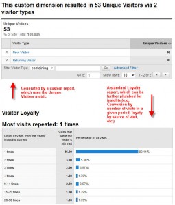
Here are two reports combined in one graphic, both from snapshots of a site's analytics. I chose it because of the numbers. They're small enough to add up; which is still often a tall order in web analytics. Also, because of their size, they

Metric versus Dimension, you say?

Understanding what a unique visitor is requires knowing a bit about how the system measures things.

Google Analytics allows for flexible reporting by creating categories of things, Dimensions, and then counting them using Metrics.

Think of how you describe a newborn’s vitals stats:

  • Weight = 6 pounds 5 ounces
  • Length = 18 inches

(By guessing at that last number I may have inadvertently revealed that I’ve never had a child or been around a delivery, and haven’t a clue what a typical newborn’s length is).

The point is the first part of the sentence is the dimension and the second part, which is the counting part, is the metric. Thrown in at the end is the unit of measure — ounces and inches.

Google Analytics blows people’s minds by having both a dimension and a metric to describe one thing: visitor frequency.

This is sloppy, and it’s a measure of how Google improves its products in gradual increments. GA is an analytics system that is excellent but experiencing growing pains.

It is here — with GA’s parallel accounting of visitors — that the whole unique visitor thing starts breaking down.

You see, in the GA API data dictionary, there is a dimension called “ga:visitCount.”

In October of last year Google started phasing out its predecessor, “ga:countOfVisits,” from which the “Absolute Unique Visitors” had always been generated.

Now when you look that old dimension, the data dictionary describes it this way: “… (deprecated) … See ga:visitCount.” If you look for ga:countOfVisits in the GA API data dictionary, you’ll even see it’s been grayed out.

The description goes on to say this now-mostly-vanquished dimension is the “Number of visits to your website,” and is, “calculated by determining the number of visitor sessions.”

So it’s “ga:countOfVisits = 1” that gave us Absolute Unique Visitor.

For my clients, when I look for that old workhorse of a KPI in the GA Dashboard navigation, I see it’s gone totally missing. Does yours still have it? The answer depends, I’ve been led to believe, on where you are in the phase-out yet. Eventually the Absolute Unique Visitor will be completely wiped out, in favor of “ga:visitCount = 1” — Unique Visitor.

There is also a metric (as opposed to those two dimensions I was telling you about), called “ga:newVisits.” This is extremely useful. But it is a metric, so it can only be expressed when paired with a dimension (is 18 inches meaningful at all if it wasn’t associated with a newborn?).

The data dictionary describes this metric as “The number of visitors whose visit to your website was marked as a first-time visit.”

The Man With Two Watches

This is a lot of ways to find the same thing — How many visitors, without repeating any, have come to your site? I’m reminded of the Chinese adage, “The man with one watch always knows what time it is. The man with two is never sure.”

The only reassuring news is this:

It is only analytics reporting that goes much deeper than a superficial number that actually provides actionable insights. Visitors — unique or otherwise — only become truly important to a business in terms of what they have done and what they’re doing now!

If you want to share a laugh about this topic, I present this YouTube video of Avinash fielding questions from viewers. He laughs nervously, but then provides the news that the phase-out is gradually progressing:

Netflix and Amazon customers are zooming past an inflection point

An inflection point is a term from calculus. It’s a place where a charted curve changes direction. Inflection points make interesting charts. They can also be harrowing for passengers zooming along the curve, hanging on for dear life. Just ask today’s struggling newspapers, publishing houses and record labels. Many would tell you that passing an inflection point is as fun as passing a kidney stone, only it takes longer. But the worst of a harrowing ride may be close to over.

At least for two industries, we may finally be rounding the midway point between mostly analog and mostly digital.

Let’s start with Netflix. I was struck earlier this year to learn that a majority of all Netflix subscribers have streamed at least some content online within the month. This is huge.

True, the delivery of DVDs to customers’ mailboxes is already partly digital. The first “D” in DVD is “Digital.” But reliance on the U.S. Postal Service to deliver those digital packages is fraught with expense and inefficiency; Expensive, because —  to quote Jeff Jarvis — atoms are a drag. And inefficient, because you need a physical warehouse of disks. Only a finite number  of people can watch the same film on the same day.

Then, earlier this week, I read that Amazon is now selling more e-books than hardcovers. The speed of this shift to reading on Kindles, iPads and other e-readers is a surprise even to those who should know better. Amazon says they now sell 180 e-books for every 100 hardcover books. A few months ago it was only 143 for every 100!

This is even more astonishing when you take into account that, according this New York Times article, “Amazon has 630,000 Kindle books, a small fraction of the millions of books sold on the site.”

Change is painful. But the worst pain is cyclical.

Sometimes it feels like the world is racing to a terrible future — similar to the ancient world maps where waters on the outer fringes had sober warnings of sea monsters. But at least from a cultural / technological perspective, call me an optimist. (I don’t speak here of the world’s geopolitical or ecological fate, and don’t get me started!)

I believe the voyage around this and similar inflection points is taking us to a pretty cool place. We just need to hold on tight and be prepared when we hit land. The other side of this curve will be as brimming with opportunity as it is different from the world we know now.

Web design tips to get the most out of Google Analytics

If you’re redesigning your site, or working on a redesign for others, isn’t it time to stop and think about how you’ll be measuring success? Follow these six guidelines to ensure that the output of what you produce won’t be left to guesswork. These recommendations will help you design your new site in a way that works well with Google Analytics.

What if you’re not using Google Analytics to measure traffic? Most of these tips are equally applicable to other JavaScript driven, “cookie-based” analytics systems. Ultimately all these systems can all use a little loving attention during a site’s design!

1.) Add Google Analytics scripting to all pages

Every page that you’d like to measure needs to have the GA scripting appearing somewhere in the code. It’s often omitted from pages that load in “real” pages using iFrames, or other pages such as obscure forms. This isn’t a problem until you need to measure these page loads as steps to a GA “Goal” (what Google calls a conversion). Sometimes this page even becomes the Goal itself.

2.) Try not to convert on another site

In other words, if possible avoid having a call-to-action point people to an extranet, or some other site configured exclusively for processing transactions. Instead, always strive to have those actions take place on the same site, with pages that are fully coded for GA monitoring. Otherwise, you bring visitors to the point of converting and Poof! They’ve left you. Then you’ll have trouble measuring those conversions in the Google Analytics reporting.

3.) Choose AJAX over Flash when possible

GA is driven by JavaScript data that’s delivered off of HTML pages. Combine that with the fact that AJAX is fundamentally JavaScript and you won’t be surprised to read this advice. Sorry, Adobe Flash!

What’s more, with HTML5, Flash is becoming even less crucial when you need to deliver a high-end presentation experience. Of course, somethings there is not option.

When you must add Flash, and it often happens, be sure you’ve included code in the Flash ActionScript to gather the right data and pass it to the JavaScript surrounding the Flash embedded file. If that all sounded like Martian, relax. Then show your developer this post on how to integrate GA into Flash.

4.) Ensure each of your page titles is unique — and yes, give each page a title!

Does this look familiar from the search engine optimization advice you’re read? It happens to be one of the most important things you can do to help search engines. You’ll recall that search engine optimization (SEO) experts also recommend you load these <title> tags with keywords that matter from an SEO perspective. But that’s not why I recommend it here.

Name your pages uniquely and it will be easier to generate user-friendly reports of page views and pathways in GA. In many places on the dashboard, Google Analytics’s reporting allows for real names of pages to be listed, instead of web addresses.

This wonderful feature is sorely underused because so many sites have duplicate page titles — or too many pages with no titles at all!

5.) Ensure one URL per page

Some sites include two or sometimes more web addresses for many of its pages!

Here’s a hypothetical situation. If a webmaster of a site wanted to give a blog contributor a more user-friendly (and search-friendly) profile page, they might use a redirect. For instance www.mybusiness.com/display.asp?ID=463 might become www.mybusiness.com/writers/bill-smith/ That’s awesome, but I’ve personally encountered businesses that accomplished these friendly web addresses through sometimes hundreds of redirects that aren’t at the DOM level. It takes a 301 or 302 to do that DOM level change, which is the only way that GA can log page views correctly. By using other types of redirects to create these new page URLs, the webmasters create a mess in GA!

Imagine: How do you measure page views and much else, when GA reports one number of views for the first URL, and a second number of views for the second, both for the very same page? The answer is you either have to add them up, or hope webmasters followed #4 and used truly unique page titles. Otherwise the consequences is a ton more work extracting good data and a limited scope of what you can report!

Here’s a great post from Google on 301 and 302 redirects and their effect on Google Analytics.

6.) Create Logical Page / Folder Hierarchies

Google Analytics reports best when pages are organizing by folders — either real or generated (using those 301/302’s and a smart set of rules). That example above could have pages along this organization:

www.mybusiness.com/products/display/

www.mybusiness.com/products/maintenance/cleaning/

www.mybusiness.com/products/maintenance/repair/

You get the idea.

The consideration of folder names and levels is extremely important, not just to help humans and search engines, but to make your reports in Google Analytics a little easier to understand. They sometimes make the reporting more accurate.

Note: These folding level are NOT necessarily reflective of the navigation within the site. It is not necessary that they coincide perfectly. This foldering protocol would be purely the URLs displayed in the browser address bar, and nothing else. You could have differences in, say, the breadcrumb navigation displayed on each page.

Are there others I missed?

Those are the six more obvious rules for designing sites to work best with GA. Your comments on other ways are always welcome.

One final tip

Here’s a terrific post for the Google Analytic power user, to help find and fix duplicate page names, or to provide in reports both a page URLs and names.

Twiducate concept is too good to stay in the classroom

Yesterday Naomi Harm give a keynote address at the Lake Geneva Schools Technology Academy, an educational event for elementary, middle school and high school teachers. Although I wasn’t at the event, word reached me about a social media-inspired educational platform called Twiducate. Similar to Yammer (“Twitter for intra-business communication”), Twiducate does not use the already overtaxed Twitter platform, but instead uses many of the principles that make Twitter so useful.

I took a test-drive of Twiducate last night, and two things struck me. The first revelation I had became the title for this post; The developers of Twiducate will be hard-pressed to stop work groups other than classrooms from using the tool. The other revelation is about education reform. Yes, reform won’t happen on its own. But certain facets of it will happen naturally, “seeping in” from the emerging social media zeitgeist. Avoiding new teaching environments like Twiducate will be like holding back a rising tide.

Here’s a video:

So: Will the subversion of this tool be harmful?

I think asking the question is moot. This type of thing will happen regardless. I’m thinking of at least two other examples of where a social network is forced to morph because of the unintended uses those pesky members decide to put it to.

  1. Fotolog.com started as a primarily photo-sharing site, similar to Flickr.com. But its meteoric growth in the last decade — especially in Chile, Argentina and Brazil — was due to users hopping on to connect and generally socialize. Sharing favorite pics became secondary.
  2. If the above sounds like dumb luck — like simply being in the right place with the right product (read: social toolset) — you’re right. And you’re also probably thinking of my second example. Although Mark Zuckerburg might posit that Facebook’s growth was all part of some master plan, we shouldn’t forget that he built it in his dorm, six years ago, as merely a “Harvard-thing” — primarily an easy way for him and others to organize study groups.

Check out Twitucate. Do you agree that it’s more than education’s new “Moodle-killer?” Does it have “legs” beyond academia, and is that a good thing?

Jim Raffel to talk about business blogging strategy at Milwaukee Likemind

As co-host of Milwaukee Likemind (search for #MKElikemind on Twitter), I never fail to enjoy the presentations. True, I help to choose the content … but take my word for it. I’m also constantly surprised by the fascinating twists and unexpected tangents these conversational events take.

Haven’t you waited long enough to check one out? Here’s the information on next Friday’s event, from the MKE Likemind Posterous blog:

Jim Raffel, CEO of ColorMetrix Technologies and blogger at JimRaffel.com, has some big ideas on how to improve your blog. At least, he has formulated and put into practice many ways to improve his own blog, and he has offered to share with you some of the best. Jim will be speaking at the July 16, 2010 Milwaukee Likemind, starting at 7:00 AM. …

Even if you do not currently have a blog, or manage a blog for your business, Jim’s message is one you should hear. That includes:

  • If you don’t have a blog now, considering getting one
  • Consider your blog a way to advance your personal brand
  • The blog as an “ongoing job interview”

“Twitter is great, but it’s microblogging. It gives you a chance to say what you’re thinking. But it doesn’t represent rich  ideas or insights” Jim said. “Your blog is where you can drive people to find out more about you.”

The event will be held at Bucketworks, 706 5th St., Milwaukee, just north of National Avenue. Here’s a map.

If you’ve heard Jim Raffel speak, you know what an engaged and exciting speaker he is. His blog is a new one that I’m following, and I’m finding the content valuable and well presented.

I hope to see you in a week!