Boost web conversions by greeting search engine visitors with unique content

How often do you come across an account of the same new, breakthrough idea from two different sources within 24 hours? That happened to me this weekend, and even if I had just seen it once I would have found the idea extraordinary. First, I read how Offermatica provides a content management solution that helps with multivariate testing of offers and copy. From what is learned, customized content can be delivered in real-time, based on behaviors. Offermatica CEO Matt Roche describes a novel application of this tool in a MediaPost blog interview:

[With the client site, MusicFriend.com] when someone comes to the home page [from a search engine] we know nothing about them, so they get the home page. What if we repeat the keyword that they searched on to get there, just show similar information? That increased the conversions. We repeat your keyword so you have a connection. Then we install affinity targeting that says when you go to the drums section and come back to the home page it will show you more drum offers. It increased the conversion rate in double digits on all the categories where we did category affinity.

The emphasis was my own. Double digit conversions?!? What a great trick.

Then I read Todd Friesen’s piece describing the same technique, in the July, 2007, print edition of Online Media, Marketing and Advertising (OMMA — and yes, it’s also a MediaPost publication). Phrased a different way, it suggests the same brilliant strategy:

… Did you ever notice how most brand traffic lands on your home page? Even product terms that contain branded verbiage often get a home page ranking ahead of a product page. Most home pages are pretty generic and usually run creative speaking to a straight brand message or weekly deal. How do you refine that on the fly to positively impact conversion? With a good multivariate tool, it’s relatively simple.

Some tools have the ability to recognize a search engine referral and identify the search term to define the creative displayed in the marketing modules on the home page. SEO managers then populate the “hero image” with a product related to the search and then load the complimentary products into the secondary marketing modules.

It is standard practice to do something like this with pay-per-click ads. We create customized landing pages that repeat the keyword phrase used in the search. This idea extends that landing page mentality to organic search results.

There is conjecture that the radio was invented in several places around the world at the same time. I suspect there will be similar arguments as to whom originated this simple and elegant way to improve the user experience for people arriving from search engines. All I can say is, I’ll glad I learned about it at all, so I can begin testing it with some of my clients.

Any readers who are already using this technique?
Why the best landing page is no landing page at all

If the term “devil’s advocate” didn’t already exist, it would need to be invented to describe Ron, my esteemed — and admittedly cranky — colleague to the east. In my last post I wrote that a landing page is an extension of the ad(s) pointing to it. He called me on it, and in doing so reminded me that not everyone shares this perception. Here’s my clarification, Ron. Thanks for keeping me on my toes.

I’ll explain why it is true that a land page is an extension of its referring ad, but also, the landing page should ideally be planned well before any type of ad is ever constructed.

And finally, I’ll explain why, as the title of this states, the best landing page is no page whatsoever.

So what do I mean when I say the landing page should be built first? Frankly, the entire process should be built backwards. It should start with the objective — namely, the action you want your audience to take. Desired actions can include the following:

  • Subscribe to an e-newsletter
  • Register to download a whitepaper
  • Commit to a purchase

Thus, each landing page should have a call to action. What’s the ideal number of calls-to-action per landing page? Exactly one. Any more can diffuse the power of the page.

All efforts should focus on qualifying the prospect and leading that person to a speedy “close.” Although you won’t be able to close every interaction — or even most interactions — your goal is always to maximize the close rate.

My friend Ron used the analogy of a car dealership that serves customers who arrive thanks to an ad. As a way to test my assertion, he said this makes the dealership “an extension of the ad.”

Not quite, because, as he muses later in the comment, entering the dealership “marks the transition from advertising to selling.” The dealership is not an extension of the newspaper ad (let’s say) because the ad already elicited the desired commitment. It brought in the consumer. Mission accomplished.

But this got me thinking: What if the car dealership ad appeared on a web page instead of on newsprint, or in the pages of a magazine? Actually, little changes. If its objective is to simply get someone to come into a dealership (not usually the case in online automotive ads), I could imagine an interstitial or rich-media web ad that provides enough information to get a commitment without ever clicking through to a landing page.

Here’s what I mean by a rich media ad. It’s a fun ad for the Nissan Quest. This one, like most, sends folks to a microsite. But if all you want is to cause a visit to a dealership, I could see a rich media ad that asks for a zip code and returns the nearest dealership information — perhaps even offering a map and driving instructions. This would all be done within the ad, on the web page where the ad appears.

In this way, like its print counterpart, the online ad gets the commitment with the least amount of “friction” by never referring to a landing page at all.

In a perfect world, all banner ads would work this hard. But because most calls-to-action need more information delivered before a commitment can be generated, the friction of landing pages (and yes, also microsites) are necessary. They are essential extensions of online ads.

Testing uncovers 6 keys to landing page success

Landing pages are expansions of ads. Every banner, email offer or sponsored listing worth its salt points to a single, hard working page. What sort of work do these pages perform? Selling, plain and simple. But to succeed, the approach to designing these pages is neither plain nor simple. Tools like Google Website Optimizer allow you to test for yourself. These automated systems help you discover exactly what combination of components works best at converting your page’s visitors into customers or qualified leads.

But what components do you start testing? And what factors should you be paying attention to as you get started?

Luckily, a lot of testing has already been done, and their findings tell you a lot about the complexities of the human mind. Here’s an excerpt from a wonderful report from Marketing Experiments:

Landing Page Performance Elements

Through extensive research, Marketing Experiments has identified six essential elements that affect landing page performance:

Friction — [This is] caused by elements of the page that require a prospect to do extra work and increase the likelihood of abandoning the page due to fatigue or irritation. Incentives such as bonus gifts or special offers can make the offer feel more worthwhile and encourage the visitor to continue.

Visitor Motivation Level and Type— [These] are factors that influence how many will remain on the site or bounce off. The nature and level of visitor motivation is essential to what landing page attributes will prove to be the “stickiest.” If people really want something, they’ll put up with more friction.

Value Proposition — How quickly, clearly, and effectively the landing page conveys the site’s value affects its ability to move visitors to the next step and not abandon the site. [The authors call this level of abandonment the “bounce rate.”]

Anxiety — All visitors arrive at a site with an initial level of anxiety caused by their perceptions of the relative risks associated with the site, the company, and the product.

Credibility Indicators — You can improve click-through and conversion by including page elements that convey trustworthiness through credibility indicators such as awards, privacy policies, certifications, testimonials, and longevity statements such as “serving the needs of ___ for more than 15 years.”

This report also has an excellent exploration of when to use short versus long copy. Happy testing!

Name-googling matters in business, even for execs still in the womb

A term made popular in the 1990s was You, Inc. As we travel through our careers, each of us needs to think of ourselves as brands. These individual brands are like product brands. They have names and reputations, to be nurtured and merchandised. Two recent stories from the Wall Street Journal (WSJ) remind us of the new power of our personal brand names in a world where Google has become a verb, as in “to google.”

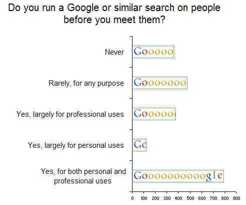
The first story talks about how often executives do search engine research on business contacts before they meet them. You may be surprised that more than a third of those surveyed by the WSJ (37%) said yes, they google people for “both personal and professional uses.” Another 18% said yes, but largely for business purposes. Taken together, half of all of the 2,118 executives surveyed use search engines to check out business contacts.

 More than half of those surveyed use search engines to check out business contacts

The other WSJ story makes sense in this perspective, because it describes how many expectant parents are choosing the names of their unborn babies based in part on the name’s lack of competition in search engine results. As the title of this article suggests, You’re Nobody Unless Your Name Googles Well.

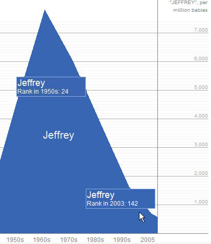
As a side note, I was humbled at what a flash-in-the-pan my first name has been when you see its popularity charted over the decades. Check out this fun iVillage Baby Name Wizard to see how your name has held up over time.

 Are you expecting a baby? PLEEEASE name him Jeffrey!

Ogilvy on web advertising

My alternate headline for this post is: Winning web headlines can be long, but watch your column widths. Here’s why …

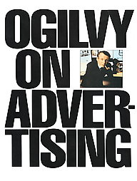
Ogilvy On AdvertisingThe book that first inspired me to get into direct response — a move that led directly to my love of interactive marketing — was written by a famous ad man. Remarkably, David Ogilvy’s Ogilvy on Advertising is still in print. More remarkable is how much of his advice on successful direct marketing, print and television ads is still relevant. And directly transferable to the web.

I was thinking of him again today when I was in a design meeting where one of our web designers was counseling against an overly wide column of text. He said, “We don’t want this column to span more that 400 characters. More than that fatigues the reader.” Wow, I thought. This advice is almost verbatim from a book that predates the web as we know it by at least 10 years.

Headlines are another source of attention — and often misunderstanding. Although headlines linking to web pages can be short and still be effective, they should be long enough to get the job done. Abe Lincoln, when asked how long a soldier’s legs should be, was said to have answered, “Long enough to reach the ground.”

I’ve learned a lot by following the advice of the excellent Brian Clark, in his CopyBlogger. He periodically singles out strong headlines, based on his experience in the business. (And thanks again, Brian, for citing one of mine). His criteria remind me a great deal of Ogilvy’s, which was based on some of the deepest readership research done at the time for advertising. Here is Ogilvy’s take on the headline:

[Our research] reports that [print] headlines with more than 10 words get less readership than short headlines. On the other hand, a study of retail ads found that headlines of 10 words sell more than short headlines. Conclusion: If you need a long headline, go ahead and write one.

Other tidbits of his that apply to online headlines and links include the following:

  • Headlines containing news are “surefire” — they are recalled by 22% more people than ads without news (and lots of pay-per-click research shows that they generate more clicks)
  • Never use all capital letters — they’re less readable in both print and online. And with the web, people may think you’re shouting, to cite the classic email netiquette tip
  • Whenever possible, promise a benefit

So what is the longest character count we counsel for headlines? Keep them to 75. It’s the standard set by Digg for their listing’s headlines. And this number is just a few characters greater than the number that is indexed by Google (according to lore and legend) when Google’s spiders read a page’s Title tag.

Which brings up an argument in favor of the longer headline that Ogilvy couldn’t have anticipated. Length improves the chances of including a keyword that will move your page higher in search engine results pages. That’s the sort of down-and-dirty selling tactic that the late Mr. Ogilvy would have loved.