Build a Google Analytics campaign spreadsheet that also crafts the links!

Dorcas Alexander wrote on the Luna Metrics blog recently about an important and often-overlooked topic: Organizing the campaign information you can gather in Google Analytics. I’m following up here with a way to document your campaigns. This method also solves the problem of constructing the special URLs used to create those campaigns in the first place.

If that seems a little opaque to you, read on. I suggest you start with this excerpt of Dorcas’ post:

It’s so easy to tag your campaigns for Google Analytics that you can quickly fill your reports with a mishmash of labels and end up with campaign tag soup! But what’s the best way to get organized? Even if you know what medium and source mean, it’s not always obvious how you should fit campaign info into those slots. And what about the extra slots we get for campaign tags like campaign and content and term?

It goes on to list four simple steps to preventing confusion. The fourth discusses documenting your work. It recommends how — by setting up a Google Docs spreadsheet, which can be shared among all content or analytics team members. He goes on to say, “Another good thing about using a spreadsheet is that a formula can pull all your labels together into a campaign-tagged URL.”

That’s a great idea, but how exactly can this be done?

Here’s my how-to, an addendum to that Luna Metrics post.

Above is the Google Spreadsheet I created for a former client (I needed to stop working with them when I joined Accenture). I’ve replaced the live information they were using with some of my own, to protect confidentiality. I’ll assume you already know how to set up a free Google Docs account, which includes the use of their cloud-based Excel competitor, named Spreadsheet.

  1. Create five columns: Output URL, Target URL, Formula, Campaign, Source and Medium. But wait!, you say. Where is that third column? It’s the Formula column, and is hidden here. I hid it because, a.) It looks identical to Output URL when you have live data in there, so it was redundant, and b.) I prefer to keep it hidden because each cell of that column contains the same formula — one that you definitely don’t want to accidentally change or delete. If I were setting up the system in Excel, I’d make those cells protected.
  2. Before “hiding” column C, place this formula in it: =((((((((B2&IF(ISERROR(FIND(CHAR(63),B2,1)),"?","&"))&"utm_campaign=")&D7)&"&utm_source=")&E2)&"&utm_medium=")&F2)) This formula confirms that the target URL (in cell B2) does not already contain a question mark in it. If it finds one already, none will be added. If it finds no question mark, it added one. After that it builds a trailing URL string that will be familiar to those who roll their own URLs, or use Google’s URL Builder. Once you’re done you’re safe to highlight the column and hide it.
  3. In the Output URL column, place a far smaller formula: =C2 Yes, that’s all. Just display the contents of the hidden cell C2 in the visible cell B2.
  4. Populate the Target URL cell in that row with the web address of the landing page you want to tag with campaign information.
  5. Finally, fill in the Campaign field, along with the Source and Medium fields. These are the unique names of the campaign you wish to credit that visit to, along with the web site or social app it was came from (e.g., Twitter, or Jason Falls’ Social Medial Explorer blog), and the general medium (e.g. social, or web).

That’s it! In the Output URL you’ll find the line. Copy it, and paste it wherever you are setting up a hyperlink on another site or digital channel. For example, that top line shows the URL I used when I was Tweeting about my recent blog post extolling the new release of an Excellent Analytics upgrade.

In the rows to the right of those I’ve shown, you can make notes about when it was used, why, and how you promoted the link. All of this can be helpful when you pull the campaign, source and media statistics for analysis.

I hope this helps. Let me know what improvements you might have experienced in how to catalog your campaign information.

Using Google Analytics’ New Report Dashboard

My work with Accenture has meant this blog has been silent since I joined. I’m loving my work there, by the way. But as for the central focus of this blog, I’ve been continuing to have fun in my off hours with web marketing analytics, especially using Google Analytics. If you use this app, you know they’ve launched a major upgrade of their reporting. It includes a way to create custom dashboards. Below you’ll find one small way I’ve used these new custom dashboards to save time and gain valuable insights.

Until I joined Accenture I was one of the contributors to Jason Fall’s exceptional social media marketing blog, Social Media Explorer. I miss being in such terrific company (they haven’t kicked me out of their Facebook group, something I’m very pleased about). I also miss those posts and the greater audience they had afforded me for my ideas on measuring social media.

But all was not well. I had always wondered how often people viewed my posts, the way I can with this blog. Yes, I could see which posts were the most likely to go viral. I could get that like anyone, from this summary of all of my posts there.

Then Jason shared with his contributors full reporting access to his Google Analytics metrics. Heaven!

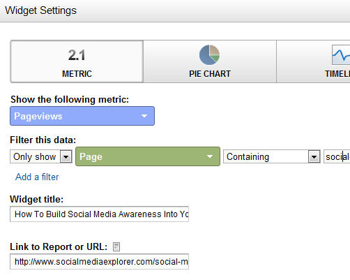
Now I had a different problem: I could see aggregate information, but there was no easy way to view just the information about my pages. If the structure of the site had been, say, “domain.com/jefflarche/blogname,” I could view only the pages starting with /jefflarche/. That’s not the case, though. So I walked away, vowing to someday find a way to create a report that would give me a breakdown of my posts, at least for the KPI of Page Views. I got busy today by creating a new Dashboard for the profile. I then populated it with Widgets. Here you can see what the set up looks like for each widget I added (one per post):

Below are the steps taken in this form:

  1. I chose the widget called “Metric.” This shows one number only (along with a couple of others, for context), instead of a chart, a timeline or a table
  2. I chose the metric of Pageviews. But I needed to add a filter. For that, you can see I chose to only show the count for pages that contain a unique string. For this example, I chose the unique string social-media-awareness-measurement/ portion for this post’s URL
  3. I gave the widget the title of that post and linked to it so reviewing content for hints of popularity (or lack thereof!) would be easier

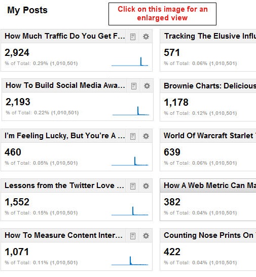
Pretty easy, no? Once I had added a widget for each, this is what I got:

So what insights can I glean from this? First of all, it took a while to build an audience. I learned as I went along, from the first post (lower right corner) to the latest (upper left). I knew this from other measures, which made it particularly sad for me to walk away from the posts. I saw a growth for 693 percent, comparing the views my first post got versus my last.

Turning Information Into Insights

Here are other insights:

  1. People love “how to” content, and respond to headlines that contain those magical words. (I knew this from my direct response days, but it’s cool how thoroughly this has been carried to the online world.)
  2. People like to read reviews of relevant books. That’s what I did with the extremely popular post Lessons from the Twitter Love Guru
  3. Sparklines can give valuable hints to user habits

This last one isn’t readily apparent. I’m going to assume you know what a sparkline is and just say that each of them above shows a sharp rise and fall in readership. After the week it has been posted you can see the view plateau very near zero. It’s to be expected. But there was an outlier, which you could only see if you viewed the full report. It’s shown above right.

Not only did this post not immediately “click” with readers (look at the leading tail), but once it did, its tail at the end is thicker, showing more ongoing popularity. If you’ve been a reader from the start, you’ve already read here and elsewhere about The Long Tail. Here it is in action!

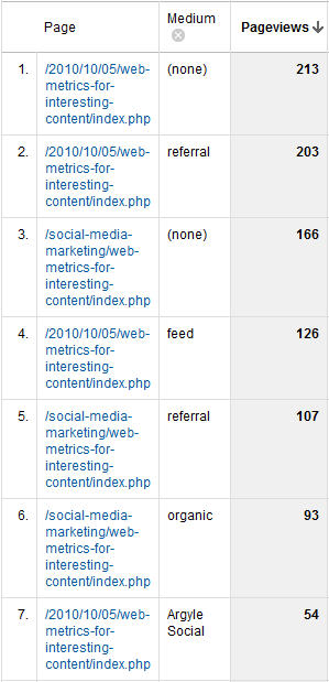
This odd sparkline caused me to dig deeper, and I saw this report for all sources of visits to that page since it post (to the right).

It shows a significant number of links from referring sites and search engines. The referrers obviously liked the content enough to send their readers to it. And search engines? This is the ultimate long tail. I even got four visits from Google for the phrase “measure if people share your content on social media.” Believe it or not, this is hotly contested (I no longer show up for this phrase — at least in the top three pages).

By the way, “feed” stands for Feedburner, which means the fourth (or third, depending on how you look at it) source of visits is people who read Jason’s blog using an RSS reader.

As I said, it pays to be in cool company. By the way, here’s a shout-out to Argyle Social. They’re right near the top as a source for clicks to this page. Their latest post, Is Post Automation Effective? particularly fitting. I would say certainly say yes!

A Link To All of My Social Media Explorer Posts

If the headlines of the above got you curious about my content, I encourage you to visit this summary page, with links to all of them. I’ll be watching this new dashboard to see just how many of you do!

When Virtual Pageviews trump Events

There was much excitement when Google Analytics unveiled its Events metric. This meant web analytics could store several levels of information on a specific action, and associate that information with a unique web visit and visitor. Before that, if you wanted to — let’s say — record a download, you’d need to create a Virtual Page View.

So why did I recently blog on Jason Falls’ site about creating Virtual Pageviews when recording interest actions, such as “Send to a Printer,” or sharing actions, such as “Email a Friend?” or “Share on Facebook?” Why don’t I just create Events?

Using AddThis To Talk To Google Analytics

The answer is simple: If you consider sharing to be a goal of your site, you may want to set it as a Google Analytics (GA) Goal. Events, for all of their power, can’t be set as Goals.

Another action that Events are commonly used for is downloading white papers. Events seem perfect for this because you can set and capture a number of variables, such as title. In other words, you can set the Event Label as the title of the paper. But if you want to measure this as a Goal in GA, you’re out of luck.

Events don’t even “talk” to Goals. [This is no longer true – changes to GA allows any event to be used as a Goal – JL] Let’s say you want to generate a report showing how many people who downloaded a white paper remained on the site for three or more minutes. The time on site can be set as a GA Goal, but you can’t easily generate a report showing the percentage of those who downloaded that remained on the site for that time period.

You can do all of this with GA Virtual Pageviews.

My rule of thumb is this: If you need to identify more than one variable with an event (such as identifying various Actions and Labels), and you do not need to correlate these with GA Goals, used Events. For all else, stick with Virtual Pageviews.

How To Track Content Interest Index In GA Using AddThis

Here is that how-to post I was referring to:

How To Measure Interest Using Google Analytics and AddThis, posted on Social Media Explorer by Jason Falls.

How to resolve those infuriating analytics discrepancies

Yesterday I was conducting a “Web Analytics Forensics” session with a new client. They posed a common question: The monthly reports on clicks that they were getting from suppliers of their ad buys were off by 10 percent — sometimes even more — compared to their own Google Analytics metrics. The number differences were veering all over the road. Sometimes these vendor reports seemed to overstate traffic, other times the clicks seemed to be understated. When I responded, I was reminded of the reassurances that a friend of mine gives. He’s a pediatrician.

My friend Paul had told me once that the bane of pediatricians everywhere are the late-night calls from parents who are worried about their child’s fever. He doesn’t mind being awakened (well, not much), but he has trouble fully reassuring parents of this fact: Fevers are normal, even healthy. If a child doesn’t run a fever every so often, it’s then that he’d be alarmed!

Don’t take Paul’s word for it. Here is a post in the New York Times a couple of days about on this very subject.

Client concerns about analytics discrepancies are my own profession’s “fever fears.” They can be a distraction from deeper problems. (The doctor in the post mentioned a mom whose child had a fever and abdominal pains. He said his primary concern was the abdominal symptom, but Mom kept steering things back to the fever!)

So the answer to the promise I gave you in the headline is this. For media buy discrepancies, don’t bother trying to resolve them!

Unless you think you are being overcharged for the traffic you’re buying from vendors, in the form of ad clicks or affiliate links, rest assured. I’d only be worried if their numbers were identical to yours. No two systems measure web traffic precisely, or the same way. They are all uniquely flawed.

So instead, focus on what you’re doing with this traffic after it arrives. Are visitors finding what they came for? Are they returning in healthy numbers? And most importantly …

Are they converting?

Usually when I’m called in to consult, the answer to all of these questions appears to be no. Focus your attention, and your boss’s, on these issues. They are the only path to online marketing success.

Which is better? Google Analytics’ $ Index or CII?

Today I posted my first entry as guest blogger on Jason Falls’ Social Media Explorer. Not surprisingly for those who know me, I kicked things off with a description of Content Index Index — a general description and a case for its use. Posting something in such esteemed company is truly humbling and frankly more thrilling than is probably healthy to admit. (I can hear friends and loved ones chiming in now about all of my work / life balance hoo-hah!)

Content Interest Index — CII for short — forgets for a moment whether a particular user has “converted” in that user session. It scores a page’s content on behavior that takes place on that page only (or offline, regarding that page’s content, in social media). That’s quite different from the scoring of, say, a page in a conversion funnel. Google Analytics (GA) has a Funnel Report that gives value to the pages leading directly to a conversion (Google calls these conversions “Goals”).

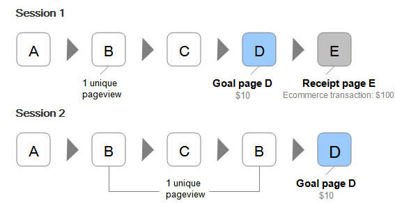
Another GA metric that tries to rank based on conversion is its “$ Index.” This can be compared to Google’s PageRank,  but it’s for estimating dollars earned by a page view, not search engine Google juice conferred by the quality of back links a page receives. It confers a portion of the dollar value of a conversion (Goal) onto pages that were viewed in the same session. Here’s an explanation and some examples (the graphic below is from that post):

Those GA scoring systems are all about the conversion, which I’m usually all for.

But as I mentioned in my post on Jason’s blog site, and yesterday, at a Translator Lab Hours discussion, people “snack” on content. They may come back to your site many times before they convert.

That means the session where they convert is likely to be brief, and the pages viewed (the ones given $ Index value) can be unfairly inflated in value.

Follow me here, and on Jason Falls’ Social Media Explorer, to learn more about how CII is calculated and how it can be used to improve the content on your web site that surrounds your conversion funnels.