Today on Jason Fall’s Social Media Explorer, I discuss my new favorite data visualization technique — one that I’m starting to move into production with web analytics reports I create for clients. Its official name is the Tree Map, but as I mention in that post, I prefer to call it The Brownie Chart.
That post has an example of how I use brownie charts to show a promising new web metric, the content interest index (CII). My example on the site uses a made-up business, Everything Brownies, with a web address of EB.com.
Note: Yes, I know. That web address resolves to a real encyclopedia site. The reason I didn’t just make up a domain name is you never know when one will go live with a site. I didn’t want to have someone inform me, two months from now, that my blog is now pointing to a porn or gambling site! Unless Encyclopedia Britannica takes a surprisingly sleazy turn, I think I’m safe.
Here is another example of how the tree map / brownie chart can make web analytics reporting easier to understand:
Charting Bounce Rates: “I came, I saw, I puked.”
I agree with Avinash Kaushik that bounce rates are a helpful way to measure how well you’re connecting with site visitors. Actually, he’s a little more enthusiastic than I am, with blog post titles such as this model of understatement: Bounce Rate: The Sexiest Metric Ever? Three years ago, on his own blog, Avinash described bounce rates this way:
So what is this mysterious metric? In a nutshell bounce rate measures the percentage of people who come to your website and leave “instantly.”
They’re the one-page visitors. Yes, they might be finding what they were looking for — but more often than not, these people just didn’t dig the neighborhood.
Avinash has refined his description over time. In his recent, truly outstanding book on measuring web traffic, Web Analytics 2.0, he characterizes bounce rates this way: “I came, I saw, I puked.”
Bounces can be reviewed for all traffic to a site, or only for certain important segments — traffic from search engines is a good example. Reporting of bounce rates can also be broken down by page.
The brownie chart becomes particularly handy for this per-page bounce rate reporting. It helps those responsible assess the severity of a site’s problem pages.
You see, you can’t easily be sure that a page with a high bounce rate really is a problem page. Think of it: If nearly everyone ups and leaves when they arrive at a particular page, but that page gets relatively little traffic, there’s no huge emergency. Content management resources are usually scarce, so it’s better to keep looking, for other pages that attract more page views that happen to have comparatively high bounce rates. It’s those more popular pages that require immediate first aid!
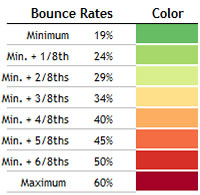
To illustrate, take a look at Everything Brownies’ bounce rates on this brownie chart. The graphic shows all major pages of this fictitious site, and shows the pages as more red if they have the highest bounce rates relative to the others. You should know that size represents the relative numbers of page views. The bigger the “brownie piece,” the more views that page gets.

 What does this chart tell us? Quite a bit.
The Holiday Brownie Baking Kit, which I placed my mouse over in this screen capture, has an excellent (i.e., low) bounce rate. It also has a ton of page views.
That means this page is doing quite well in keeping visitors from leaving immediately. Well done! On the other hand, Deluxe Baking Pan is not nearly as successful. Its relative bounce rate is quite high, and because it has the most page views of the entire site, it’s clear this page is majorly dropping the ball!
There are plenty more insights, but you get the picture.
As I mentioned on Jason’s blog, what I like about this charting format is non-math types (such as myself!) can understand these statistics immediately, and know exactly what needs to be investigated further — and in what order of priority. As my friend Bob likes to say, “That’s good stuff!”
I hope you find the potential of this charting technique as exciting at I do.
A Round of Applause for BeGraphic and Sparklines for Excel
This example of a fake report for EB.com, as well as the one on Social Media Explorer, was produced using an “Add-on” for Excel called BeGraphic. The Add-on consists of a whole suite of graphic tools — all based on Excel data and rendered within that application. The particular functions I used were part of Sparklines for Excel within the BeGraphic suite. I urge you to support the folks behind these amazing visualization tools.